


Colour psychology and colour palette with Australian Artist Ash Holmes
Shot on location at HAKE House of Art featuring artwork by Ash Holmes.
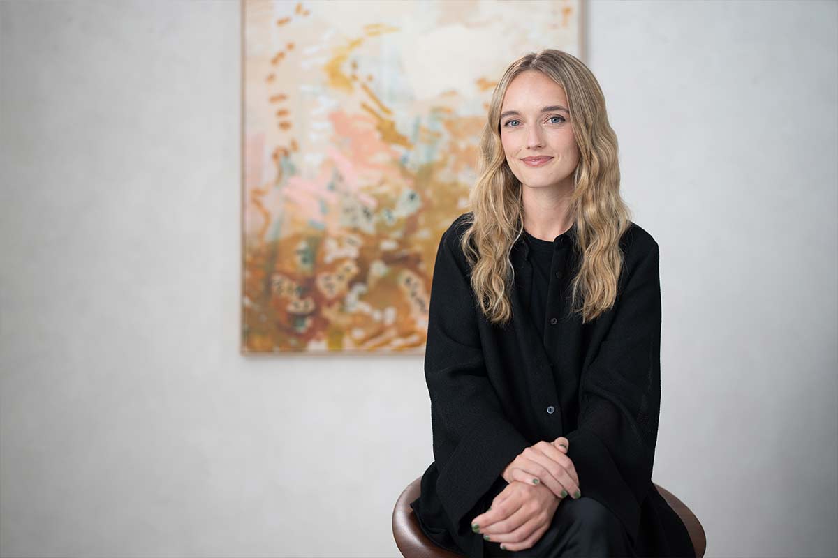
A self-taught Sydney-based artist, Ash Holmes is fully immersed in colour, its effects on the mind and the beauty that comes with creating harmonious colour combinations.
Inspired by the natural tones and compositions in the environment, Ash practices across large canvases with acrylic and oil paint.
King Living talked to Ash about how colour psychology influences her work and discovered her best colour palette tips for both artwork and interior design choices.
The psychology of colour is all about the way you feel around certain colours – some make you feel calmer, and others have the opposite effect – and there’s good reason why.
For Ash, selecting colours was always intuitive and her natural curiosity sparked the desire to discover why she was drawn to certain colours and repelled by others.
"I started to learn about the sensory effect that colour in our environment has on us on an emotional level. The scientific background between colour and how we process colour made me understand my own work in a deeper way." Ash explained.
“Now I understand why I like certain colours. For instance, I'm always quite drawn to using pink, but I don't wear a lot of pink.”
“Pink is the most calming colour. Learning about the way colour can calm our sensory nervous system was really interesting because that's exactly how I want my pieces to feel.”
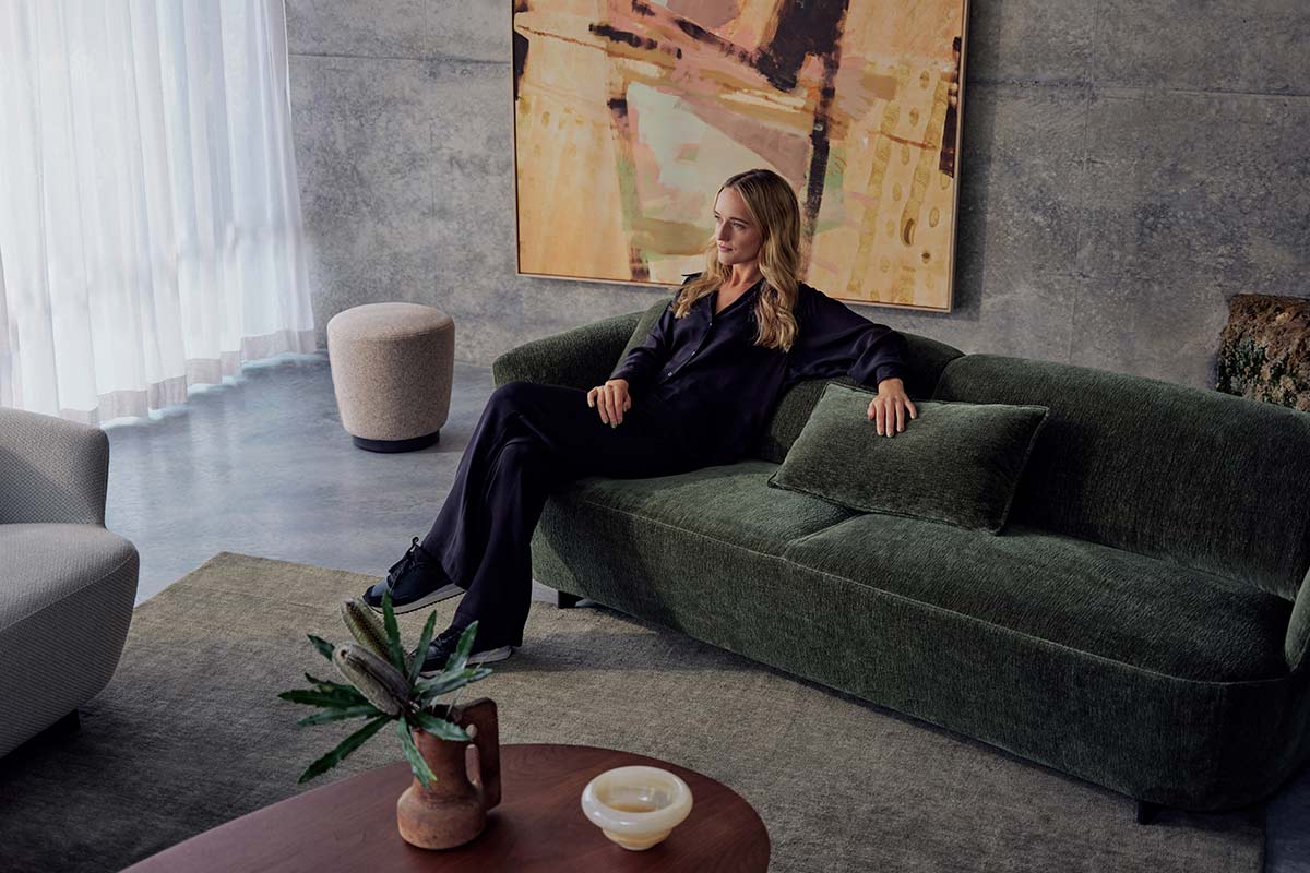 Featured: Fleur Sofa in Eveleigh Dark Olive, Fleur Ottoman High, Issho Coffee Table in American Walnut and Bruny Rug in Fern.
Artwork colour palette inspiration
Colour palette selection and colour psychology play integral roles in the artistic process, allowing Ash to evoke emotions and create visual harmony within her work.
“I usually start with a colour that I believe I want to see on an emotional level, and then I'll build from that.”
“Somewhere in between the start and finish of the piece, I'm creating contrast with the colours so there is a sort of harmony between tones that play off against each other.”
Colour combinations are carefully considered to convey specific messages and elicit particular emotional responses.
“I'll usually put pink and green together as a combination. From a primal aspect, green is nature. It's new life, it's regrowth, it's inspiring.”
“And then when you combine that with the properties of pink, they're quite a strong duo, but visually not hard on the eyes.”
For Ash, the creative process – really is a process of discovery – rather than a set routine or timeframe to produce an artwork.
“I don't work from a photo. A lot of what I'm producing is a mystery to me.”
“The work progresses as I progress with the piece, and sometimes that process can take weeks, months, or even years to complete a work.”
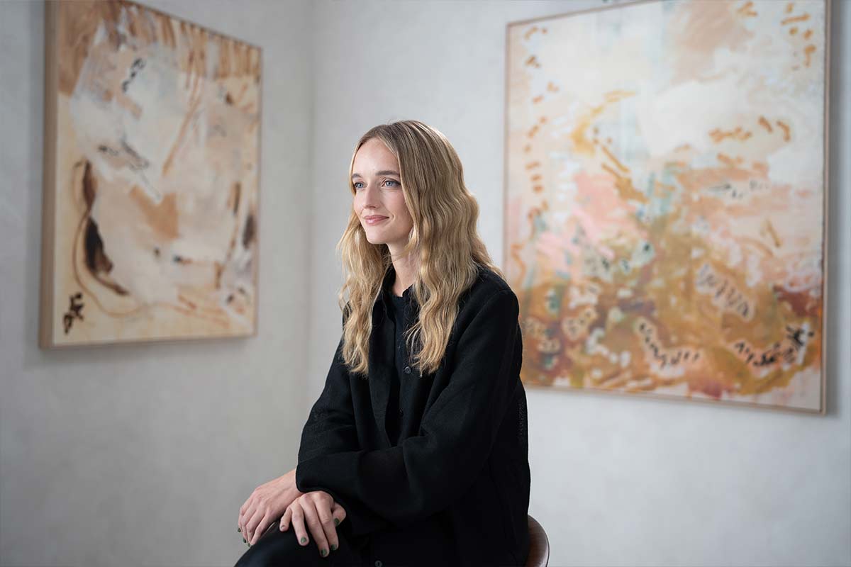 Ash Holmes pictured with two of her artworks at the HAKE House Of Art.
Colour at home
Colour has a profound impact on our emotions and overall perception of the world – which means the colours we surround ourselves with in our home can impact our moods and feelings.
For Ash, choosing colours you truly love is always the best starting point.
“I would personally steer away from trends and focus more on what colours make you feel and mean to you.”
“Look for colours you have that immediate kind of positive or calming reaction to – or any emotion that you want to feel from your space.”
Prioritising our own emotional connection to colours rather than following trends is key to achieving a truly meaningful and enduring colour palette.
“For me, colour is now about the way it makes me feel and how it brings nature into my space."
“Colours you love are always going to hold meaning for you – whether or not that personal. opinion of colour might change – at least it will always hold sentimental value.”
Ash also emphasises the importance of designing spaces based on our own desires and preferences, rather than trying to conform to others' expectations.
“It’s important to pick colours that you want your space to feel like, not what you think others might want your space to feel like.”
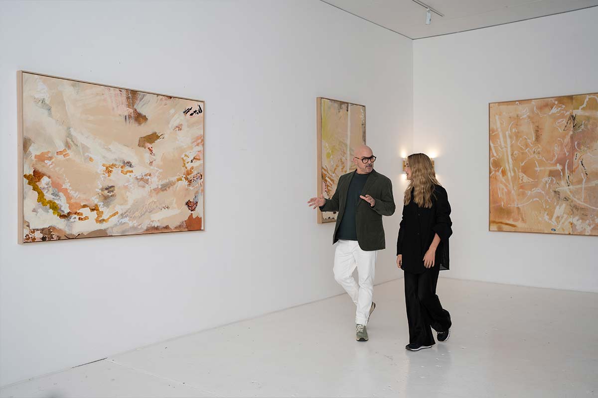 Ash Holmes in the HAKE House Of Art gallery with Neale Whitaker.
Top colour palette takeaways
By prioritising our emotional connection to colours, understanding their psychological impact, and embracing our personal preferences, we can create interior spaces that resonate deeply and evoke our desired emotions and moods.
Based on Ash’s advice, here are your top colour palette takeaways:
- Intuitive colour selection: Opt for colours based on personal intuition rather than following trends.
- Understanding colour psychology: Explore the emotional and sensory impact of colours.
- Creating harmonious combinations: Start with a colour that resonates on an emotional level and build a harmonious palette from there.
- Personal connection and authenticity: Design spaces based on your own desires and preferences, rather than trying to meet others' expectations.
With these tips, colour becomes a powerful tool for self-expression and creating meaningful environments.
Inspired by Ash and her work? Read our article about Ash’s story or find inspiration in our Colours of Australia Lookbook.
Follow Ash Holmes and HAKE House of Art on Instagram.

